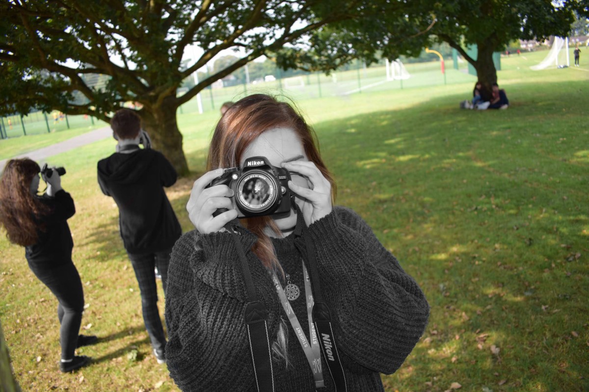
What was the overall intention of this photograph?
The photograph was planned to have a deeper meaning behind what our eyes can deceive. As you can see, the environment around everyone is coloured but people featured within the photograph are presented to be black and white. I intended to represent diversity to show that sadly not all people fit into each others shoes and perhaps all of us find it difficult to fit in at some point in our lives (eg. work, school or friendship groups.)
Strengths
- The colour splash works well
- most of the attention is drawn to the girl at the front (shallow depth of field.)
- the photo has a deeper meaning to it
- the shutter speed was at a fast rate
- presents a diversity of colour & shape
Weaknesses
- I could have been more accurate when using colour splash and double-check whether I got all of the scenario coloured (except for the people’s figures.)
What could have been improved?
As I stated previously, my only weakness was really my colour splash technique. I could improve my work by making sure I was more accurate when using the colour splash technique on Photoshop, this could have been to make sure all strands of hair were coloured and to make sure I didn’t colour any unintended areas of the photo. I could also add a larger quantity of techniques to the image. This could have been multiplicity, levitation or even just illustration to make the image more exciting.

What was the overall intention of this photograph?
This photograph was planned to present a sadder theme to it and make the audience question for themselves what is really going on in the scenario. The boy in the picture is obviously alerted about something on his mobile and this could make the audience question why the boy is so shocked. I also deliberately wanted the illustration to be quite childish and cartoony to appeal to a younger audience and present the image in more innocence.
Strengths
- The scenario made the audience question what was really going on
- Appeals to a younger audience
- The sadder theme contrasts with the child-like drawings
- It’s simplicity worked well and appeals to the naked eye
- aesthetically pleasing
Weaknesses
- Quite rough drawings and could have been more accurately drawn
- wouldn’t appeal to more mature audiences
- Using different brush sizes didn’t favour in certain parts of the illustration
What could have been improved?
I could have been more careful when drawing on the illustration to make it seem cleaner to the naked eye, although the rough drawings compliment the child-like/innocent theme I was intending. I could have also used the same brush size to make the illustration more effective (for example: the thought bubbles would have looked more attractive if one wasn’t bolder than the others.)

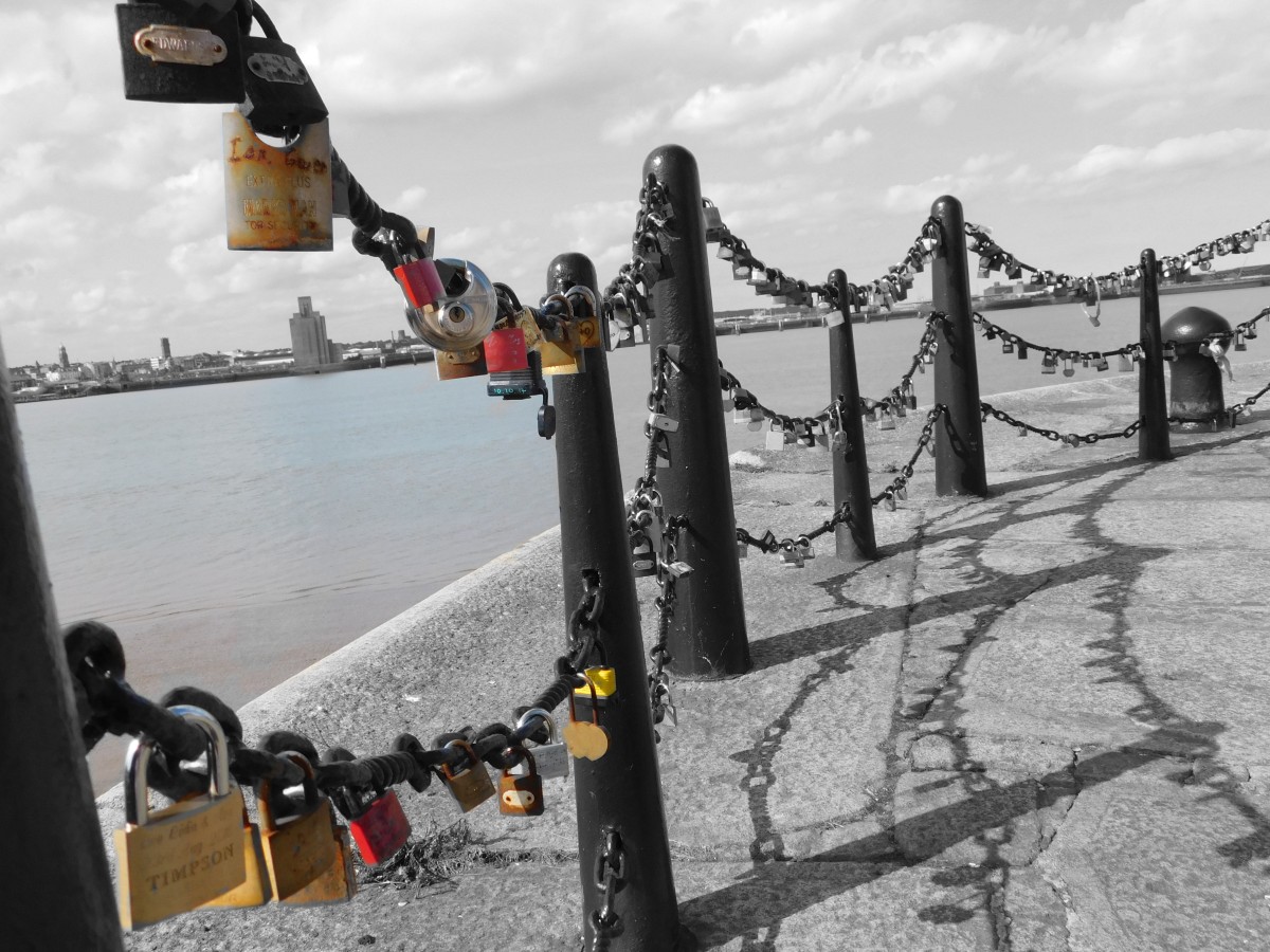
What was the overall intention of this photograph?
There wasn’t really a deeper meaning intended for this image. The photograph was purely planned to attract attention to a specific object (this being the locks.) I made the environment quite dull by using black and white and I colour splashed the locks; this made it easier for the naked eye to be attracted to the locks.
Strengths
- All attention is drawing to the locks (as intended)
- presents a diversity of colour & shape
- Appeals to all audiences
- Shadows worked well
Weaknesses
- The colouring of the sea didn’t compliment the locks
What could have been improved?
This photograph seemed to have worked well overall, although there a few factors that I could have improved. I could have colour splashed all the locks to make the image more aesthetically pleasing. I could have also left the sea black and white; this would have made the manipulation more attractive and more focus would have been put onto the locks.
